
THE BLYNX DESIGN CHEAT SHEET
Same message.
Ten new identities.
Mochi’s flyer needed a little personality. Here are the colours, fonts and signature moves behind all ten transformations.
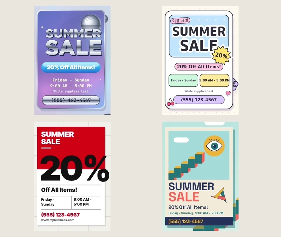 ONE FLYER. TEN POSSIBILITIES.
START HERE
Choose a feeling.
Keep the message.
In the film, the offer stays the same: Summer Sale. 20% off. Colour, type, layout and texture change how it feels.
- Pick one identity that suits the message you want to send.
- Borrow three moves: a palette, a type treatment and one signature detail.
- Check it on your phone. The headline, offer and next step should still be easy to read.
Find your next look.
Tap a style for the recipe.
Artwork is cropped directly from the Blynx video. Swatches come from its artwork source; font pairings are suggested starting points, not an exact inventory. These are creative directions, not fixed rules.
IDENTITY 01
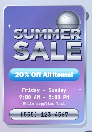
Y2K Futurism
Chrome, glass and a shiny digital future.
Try it for a tech launch, fashion drop or nostalgic digital poster.
#BFD6FF#C59BE6#C9D2E0#1C2347- FONT PAIRING
- Montserrat ExtraBold + JetBrains Mono
- SIGNATURE MOVES
- Metallic headlines, glossy pills, chrome spheres, star flares.
Try this recipe
- Start with a cool blue-to-lilac gradient and one oversized headline.
- Give only the headline a silver gradient with a narrow dark band to suggest chrome.
- Add one reflective sphere and a glossy offer pill; keep the date and contact details plain.
Make it move
A highlight sweeps across the headline as a chrome sphere slowly rotates.
Watch out for: Chrome on every line. Keep small text flat and high contrast.
IDENTITY 02
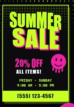
Acidwave
Loud, warped and deliberately strange.
Try it for a music night, streetwear drop or experimental social graphic.
#060608#C6FF1A#FF3EA5#7CF7FF- FONT PAIRING
- Impact + JetBrains Mono
- SIGNATURE MOVES
- Acid green, wavy display type, distorted smileys, noisy grids.
Try this recipe
- Use near-black as the base and acid green for the main headline.
- Warp one big word, then offset a magenta outline behind it.
- Add a smiley or a bent grid around the edges; place essential details on a calm dark panel.
Make it move
Let one word ripple while the supporting information stays still.
Watch out for: Distorting the offer, date and call to action until nobody can read them.
IDENTITY 03
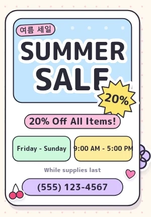
K-Design
Playful pastel packaging with tidy structure.
Try it for a cafe menu, stationery launch or friendly product announcement.
#FFF8EE#BFE3FF#FFC9DE#FFE89A- FONT PAIRING
- M PLUS Rounded 1c + Inter
- SIGNATURE MOVES
- Rounded blocks, sticker outlines, tiny labels, cute accent icons.
Try this recipe
- Put a rounded headline panel on a cream canvas.
- Split the details into pastel blocks with consistent spacing and dark text.
- Add two small sticker-like accents, such as a cherry and a star, around the content.
Make it move
Stickers pop in with a small bounce, then settle into the grid.
Watch out for: Adding stickers to every gap. This film uses one playful interpretation of Korean-inspired design, not a definition of all Korean design.
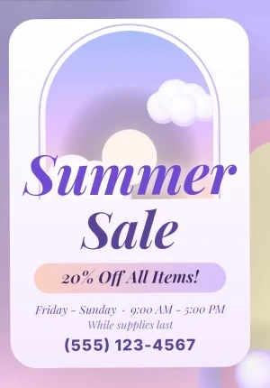
IDENTITY 04
Dreamscape
Soft, floating and a little otherworldly.
Try it for a beauty concept, ambient music cover or imaginative event invitation.
#CDBEFF#FFD0E4#FFE3CF#5B4A99- FONT PAIRING
- Playfair Display Italic + Inter
- SIGNATURE MOVES
- Pastel skies, glowing arches, clouds, elegant italic type.
Try this recipe
- Blend lavender, pink and peach into a soft background.
- Place one arch or glowing portal behind a short italic headline.
- Use deep purple for the details and leave generous empty space around them.
Make it move
Clouds drift slowly through the arch while the headline remains readable.
Watch out for: Pale text disappearing into pale gradients. Glow is decoration, not contrast.
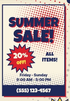
IDENTITY 05
Halftone
Printed, punchy and full of comic-book energy.
Try it for a sale poster, gig flyer or bold editorial illustration.
#F4EAD3#E8322B#1D2B5C#FFD23F- FONT PAIRING
- Luckiest Guy + Inter
- SIGNATURE MOVES
- Dot shading, limited inks, comic bursts, slightly offset print layers.
Try this recipe
- Start with warm paper, dark ink and one strong accent colour.
- Apply a halftone dot pattern to one image or background area.
- Put the key offer inside a burst and offset one colour layer slightly for a printed feel.
Make it move
Reveal the artwork in ink layers, ending with a quick stamp on the offer.
Watch out for: Dots behind small text. Halftone is a technique; the comic treatment is this video's version.
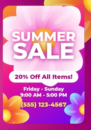
IDENTITY 06
Hyperbloom
Oversized flowers and saturated colour in full bloom.
Try it for a spring campaign, beauty launch or expressive music artwork.
#7A1FFF#FF2E93#FF7A1A#FFF06B- FONT PAIRING
- Montserrat ExtraBold + Inter
- SIGNATURE MOVES
- Giant petals, hot gradients, luminous edges, bold clean headlines.
Try this recipe
- Build a purple-to-pink background with orange concentrated near the focal point.
- Crop two oversized flowers beyond the edges of the frame.
- Keep a quieter central area for the headline; put the offer on a solid pill.
Make it move
Petals unfurl from the corners, then hold around the central headline.
Watch out for: Letting petals and glow cover the message. Preserve one clear reading area.
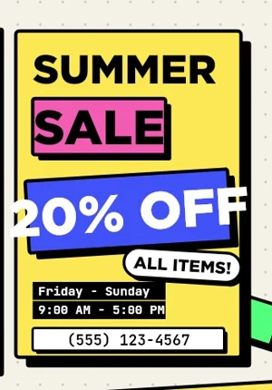
IDENTITY 07
Neo-Brutalism
Big blocks, hard edges and unapologetic contrast.
Try it for a bold offer, creator landing page or playful product graphic.
#F4F1E8#FFE14D#3D5AFE#000000- FONT PAIRING
- Space Grotesk Bold + JetBrains Mono
- SIGNATURE MOVES
- Thick outlines, flat colour, chunky type, hard offset shadows.
Try this recipe
- Start with a cream background and a bold headline aligned to a simple grid.
- Use yellow and blue blocks with the same thick black outline.
- Add a hard shadow shifted down and right; make the offer the biggest block.
Make it move
Blocks land with a short snap; their hard shadows arrive just behind them.
Watch out for: Soft shadows and decorative clutter that weaken the blocky hierarchy.
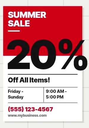
IDENTITY 08
Neo-Swiss
A strict grid with one confident typographic move.
Try it for an event poster, clear announcement or editorial cover.
#F2F0EB#E30613#111111#FFFFFF- FONT PAIRING
- Inter Tight Black + Inter
- SIGNATURE MOVES
- Flush-left type, oversized numerals, precise rules, red-black-white contrast.
Try this recipe
- Divide the layout into columns and align every text block to them.
- Make one number or phrase dramatically larger than everything else.
- Use red for one key area, black for details and thin rules to organise the information.
Make it move
Type slides into aligned positions and stops cleanly on the grid.
Watch out for: Centred blocks that ignore the grid or several equally loud headlines.
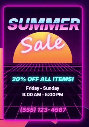
IDENTITY 09
Synthwave
A neon night drive through a retro digital world.
Try it for gaming artwork, a retro music release or a nighttime event.
#0A0220#FF2BD6#00E5FF#FFE45C- FONT PAIRING
- Inter Black + Segoe Script Bold
- SIGNATURE MOVES
- Magenta grids, striped sunsets, cyan accents, chrome and script type.
Try this recipe
- Build a deep purple sky with a magenta grid receding to one horizon.
- Add a striped sunset behind a large headline.
- Use one glowing script accent; keep dates and contact information in plain sans-serif type.
Make it move
Move the grid toward the viewer and sweep a restrained glow across the title.
Watch out for: Glowing every element. Keep the core letterforms sharp and the body copy plain.
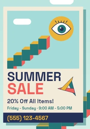
IDENTITY 10
Vector-Surrealism
Simple shapes arranged into an impossible little world.
Try it for a conceptual cover, creative studio graphic or curiosity-led campaign.
#9FD6D9#FF6F59#F2B134#23325A- FONT PAIRING
- Space Grotesk Bold + Inter
- SIGNATURE MOVES
- Flat geometry, floating eyes, impossible stairs, unexpected scale.
Try this recipe
- Choose a small flat palette and a simple horizon.
- Build one impossible scene from a staircase, a floating eye and basic shapes.
- Keep the headline and offer in a separate clear zone so the illustration invites attention without hiding the message.
Make it move
An eye follows a floating object while the staircase shifts in subtle parallax.
Watch out for: Random objects with no focal point. Make one visual impossibility the main idea.